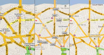
Google is a big believer in small, constant updates. Google+ and other big launches notwithstanding, it generally improves a product through small changes and tweaks. The latest comes to the Google Maps, after the UI got a major revamp adopting the new Google style, the maps themselves get some tweaks.
"Hot on the heels of our new style for the Google Maps user interface, today we are pushing out some further improvements to our map design to match the updated look and feel and further improve the usability of our maps," Jonah Jones, user experience designer at Google, announced.
"Amongst the changes you will find a plethora of subtle changes, designed to make the map cleaner, more focused, more visually harmonious, and easier to use," he explained.
The changes are all small and you'll be hard pressed to spot them all. But they do make a difference in real-world usage, labels are clearer and Google Maps can add more elements and info to the map without it looking crowded.
"Some highlights to look out for are a brighter and more cheerful color palette, a more integrated and less visually noisy labeling style, subtle improvements to footpaths and minor roads, and cleaner building and land parcel rendering," Google said.
Rather than trying to get as much information to stick out in front of the user, Google Maps is moving towards more subtle but intuitive hints, which make the map look simpler while actually conveying more info.
The changes are small, but Google is providing a couple of images showcasing the same map in 2009, 2010 and 2011. The differences can be quite significant in just a couple of years. The changes should be visible to all Google Maps users and affect all areas, but should be easier to pick out in urban areas.

 14 DAY TRIAL //