14 DAY TRIAL //
 Hangouts has always been a key feature of Google+ and it remains one of the most popular to date. Google has done its share to update the feature and make it more widely available. Indeed, since its introduction, Hangouts has become more detached from Google+.
But now it's getting a visual revamp that should bring it closer to Google+ as the new design borrows some cues from its parent site.
However, the new Hangouts look is very much an extension of the modern Google design, elements like the menu button seen in Chrome, Android and more recently in the Google mobile search page are a good example.
The same button is available in the new YouTube that is currently in testing, you can find out how to enable it here.
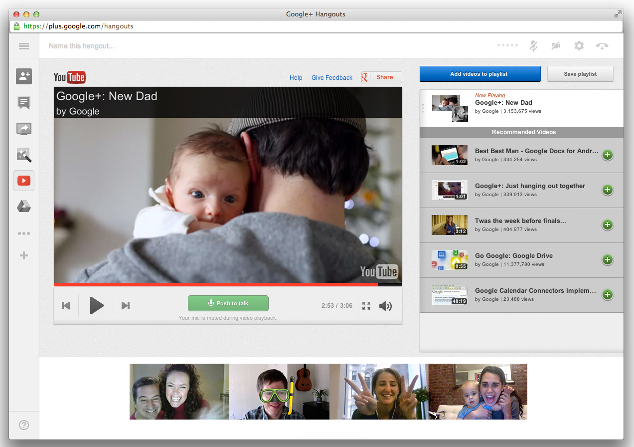
Hangouts have gotten a thorough update, though the tool still looks the same from afar, courtesy of the minimalistic design Google prefers.
Minimalistic is the word that describes the new Hangouts as well, by default, you get a big video window and a few smaller ones for all the participants and a sidebar which can be collapsed.
The sidebar offers access to the most frequently used features and apps, Chat, Screenshare, YouTube and so on.
Speaking of the YouTube app, it's gotten an update as well, the layout has been tweaked and there's an emphasis on more videos to watch after you're done with the current one.
The video calls are controlled via a few unobtrusive buttons at the top, you can mute the audio or the video, or go to the settings page there. You can exit the Hangout from the same place.
The new Hangouts should be live for everyone now, you can give it a spin on Google+, but also possibly in Gmail and other places where you can start a hangout from.