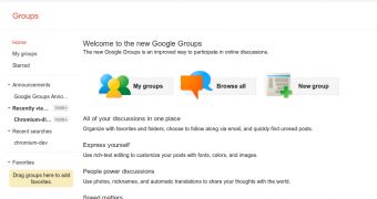
Google is updating more of its sites to the universal, 'Google+ inspired' redesign. Several months ago, Google started updating all of its websites, from the largest to the smallest, to the new Google design mantra. It's an ongoing process and many sites are still to convert, the latest being Google Groups.
If you visit the Groups homepage, you'll notice a message asking you to switch over to the new design. The new design is not the default yet, as Google is still ironing out the kinks, most likely, but there's no reason not to switch now.
The new design should feel familiar to you by now, even if you only use a few Google tools. The search engine shares it, as does Google+, Maps, Calendar and a myriad of other products.
One of the characteristics of the new design and something that Google intended with the global revamp, was a cleaner look. While Google sites have always had minimalistic design, they were not the pretties and, unfortunately, nor the most practical.
The new design wants to marry the two aspects, though it skews more towards looks most of the time, an uncharacteristic Google move.
Still, it's hard to argue against it, the new design looks and feels a lot better. And, any upgrade from the previous, ugly Google Groups design, is a step up.
As the Google Operating System blog notes, Google Groups takes more than a few cues from Google Reader, with the layout and the design elements.
Google Reader still sports the old, blue-heavy design, so if you're looking to see what the redesigned Reader might look like, the new Groups interface should be a very good indication.
However, when Reader switches to the new design, users may get several customization options, probably related to the use of space, like they do with Gmail, which is testing a redesign, and Google Docs, which is doing the same.

 14 DAY TRIAL //