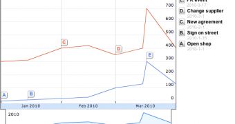
Google introduced another feature to its Docs office and collaboration suite which brings it even closer to being a complete alternative to more established desktop products. The Google Docs Spreadsheet editor is getting a brand-new charts editor with new chart types and a sleek new look.
"Spreadsheet data can tell compelling stories when placed into charts and other visualizations. Today we’re excited to announce a new editor for charts, redesigned from the ground up as well as a set of new chart types," Hillel Maoz, Software Engineer at Google, announced.
New chart types include organizational charts, gauges, annotated time-lines and the motion chart. This makes it easier to visualize your data in different ways, depending on what better suits the data type.
The old charts have been updated as well and now have more options and a richer color palette to choose from.
The interesting thing is that the new chart editor introduced automatically selects the chart type, matches the data labels to the annotations and even picks the colors for each data set.
This means that, if everything goes smooth, much of the work of creating a chart will be completed automatically. The new chart editor also includes a full preview pane so you can see what the end result will look like.
In the default Start tab of the new chart editor you will be able to choose from the recommended chart types and make several adjustments minimizing the time spent.
If you want more control, you can choose from all of the available options in the Charts tab and then customize it to your heart's content in the Customize tab.
All of the charts can be embedded on any website and the data will be updated along with the spreadsheets. You can check out the new chart types in action here.

 14 DAY TRIAL //