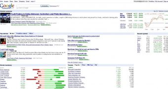
Yesterday, the Mountain View-based company Google rolled out what was supposed to be one of the most important Google Finance updates but, unfortunately for the search giant, consumers had quite an unexpected reaction following this improvement. Google proudly announced on the official Google Finance Blog that the service had received a new interface which would make using the amazing feature their product provides easier than anytime before. In addition to that, Google has also rolled out Google Finance China, a special flavor of the web service that provides information for the Asian market.
"You might have noticed today that our homepage has a new look. We've been listening to your feedback, and as a result have made it easier to follow the latest news affecting the market as well as those that are relevant to your portfolio. We hope the new look helps you find the financial information you're looking for much more quickly and easily!
We are happy to offer Chinese investors access to Chinese stock and mutual fund information as well as to other global markets through our easy-to-use and familiar interface in Chinese.
This is an exciting launch for us, and several engineers from our New York and Shanghai offices have worked hard to make this happen. This simultaneous launch of the new homepage with the Chinese site continues our momentum in adding new features and countries in the future. As always, we encourage you to send us your feedback, and stay tuned for more feature updates to come," Ayan Mandal, Product Manager, wrote on the Google Finance Blog.
Now, read the scraps in bold and have a look at the following messages posted on the official Google Finance Blog:
"The new interface stinks. Too much stuff crammed on one page. Is there any way to personalize the Finance to allow a user to limit some of the superfluous stuff?" - T-Man
"Put it back the way it was....the new one is too hard to find what was easy to find before" - Eliaf07
"The best feature of your old site was the graphical interface. I get most of the news from other sources. Now the page looks really disjointed and your best feature, the graphs, have been sacrificed. Please return to the old version or allow users to customize the page." - Z
"Horrible, horrible new look. How ungoogly! If I wanted to get financial information that looks like someone puked all over a page, I'd go to Yahoo or Marketwatch!" - Kirill

 14 DAY TRIAL //