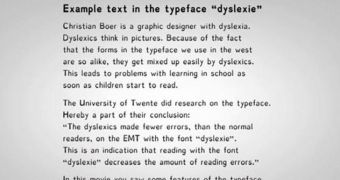
Dyslexie, i.e. a font created by Dutch graphic designer Christian Boer, is now said to make life significantly easier for dyslexics.
It won't pay their mortgage, and it won't get their obnoxious father-in-laws off their backs.
But it will help them overcome their reading difficulties, so they'll be able to take their mind off the things that are troubling them by enjoying a really cool book.
Daily Mail says that that letters written in this font all vary in shape and size. Besides, they all have a heavy baseline.
This makes it easier for dyslexics to distinguish between them, and lowers their chances of misreading a word, the same source reports.
"Reading with the font Dyslexie doesn’t lead to an increase in reading speed."
"There was however a decrease in the reading errors when dyslexicsread words that where printed in the font Dyslexie," researcher Renske de Leeuw at the University of Twente in the Netherlands explains.

 14 DAY TRIAL //