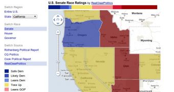
The US is gearing up for midterm elections. With a number of seats up for grabs in Congress as well as in Governor office, many are interested in seeing how are things shaping up.
With a number of sources and data points to track, it can be a daunting task which is why Google has aggregated some of the best sources under the same roof.
"With the midterm elections in the U.S. just six weeks away, everyone is wondering how the balance of power between Republicans and Democrats will shake out after November 2," Jesse Friedman, Product Marketing Manager for Google Maps wrote.
"To make tracking the blues and reds a little easier for armchair pundits, we’ve partnered with some of the most respected names in politics—Cook, Rothenberg, CQ-Roll Call and RealClearPolitics—to put their ratings in the same place and on the same map," he explained.
Available over at maps.google.com/elections2010 the map shows how many of the US states and districts are leaning. Google uses data from all of its sources to indicate if a district is Republican or Democrat leaning, or if the people are undecided.
You can switch between all of four data sources and choose a single state or the entire US. You can also switch between the Senate, House and Governor races.
Google says that new data is being added daily, so the ratings are always fresh. And you can embed the map on your blog if you want your readers to have easy access.
The elections page is powered by Google's Fusion Tables, a set of tools to visualize all manner of data. The tools are available to all users to create graphs, charts and even maps automatically, based on a data set. Google itself hosts quite a collection of data sets from various sources.

 14 DAY TRIAL //