14 DAY TRIAL //
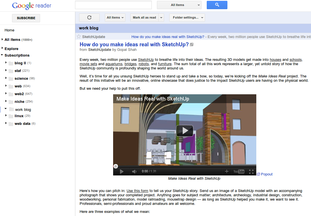
 The new Google Reader is upon us, for better or for worse. It's not a particularly horrible update, as some would have you believe, but there are some things that could have been handled better. Among them is the color scheme.
A new user style aims to fix some of the issues with the new Reader, namely, the lack of any color besides black gray and the sporadic red.
While it doesn't fix all problems, links are still black, it's a major improvement.
It brings back the blue color scheme from the old Reader, for the titles and headlines, as well as for read items and the header. All of a sudden, Google Reader is not so dreary.
To install this user style, wonderfully titled 'new interface tweaks' you must be running Firefox and have the Stylish add-on installed. Then you can grab the style from here and see how you like it.
If you want to go one step further, you can also install the Google Reader Demarginfier user script, which compacts the layout of the new Reader without going overboard.
To install this user script you have to be running Chrome or Firefox with GreaseMonkey. Opera works too. You can grab the user script from here.
These two combined create a much more enjoyable Google Reader and much closer to what Google should have done in the first place. The only thing that is still missing is colored links.
Of course, Google will eventually listen to its users and will probably tweak the design according to feedback, but that may take a while.
But if Google does fix the two major issues, the waste of space and the gloomy look, most upset users will be pleased. Hopefully, Google is listening. In the meantime, users styles and users scripts fix what Google wouldn't.