14 DAY TRIAL //
 Mid-2009 brought with it the first indications that Mozilla was planning a major overhaul of the graphical user interface for the next major iteration of Firefox, namely version 4.0, not 3.6 which is considered only a minor upgrade to v3.5, and not v3.7. It now appears that the efforts done for the Firefox 4.0 GUI redesign are starting to take contour and that the company has chosen a direction in which to take the end user experience in 2010. Included with this article are a range of sketches and mock-ups of the way designers envision the Firefox 4.0 revamping at this point in time. It is important to note that the screenshots provided here are nothing more but concepts, and certainly not the final implementation of the GUI for version 4.0 of Firefox, and that they apply only to the Windows flavor of the open source browser (especially to Windows 7).
To cut a long story short, Firefox 4.0 will feature style elements common to Microsoft’s Ribbon/Fluent GUI, but also design similarities from Google Chrome and Opera 10.5. As far as Firefox 4.0 is concerned, Mozilla is planning the “Introduction of “App” tabs. [But also to] combine location bar and search bar (separate location and search items can be customized). Tabs-on-top option (possibly left/right as well). In bar search “button” with drop down of other types of search. Ability to attach stop/reload/go to location bar (TBD). Expanded home tab functionality. Disable bookmarks bar by default if it has not been altered from default. Remove status bar. Create a place for extensions. Profile/identity UI,” revealed Firefox 4.0 developer Stephen Horlander.
Mozilla has been laboring in order to refine the concepts behind the Firefox 4.0 redesign on Windows. In this context, the focus was placed on harvesting feedback from the previous mockups that the company made public, but also on optimizing and polishing the visual, and softening any rough edges. At the same time, Mozilla has not been shy of continuing to explore new directions for the GUI overhaul.
“One of the more challenging, not to mention contentious, aspects of the Firefox UI update has been how to handle the MenuBar. On our first pass we were informed by how Safari and Chrome had handled this problem by paring down all menu items into two separate Page and Tools buttons. This approach has a few advantages but also some disadvantages. The new proposed approach to this problem is an App Button which is similar to the single menu approach taken by Windows 7 native applications (Paint, WordPad) and by MS Office,” Horlander explained.
The necessity for the introduction of the Firefox 4.0 App Button is brought on by the intention to reduce complexity for end users. The App Button would take less space, would unify all menu items in a single easy to access location, but also cut clutter on the Navigation Toolbar, and improve appearance and placement, and ultimately UX.
“One of the benefits of the App Button is that it is similar to the way Microsoft is treating its native apps and Office. Another benefit is that the placement is closer to where the Menubar would be and therefore it is more familiar,” Horlander added. “One idea that we have already explored with the Pages and Tools buttons is to use text on the button instead of an icon. This is also reminiscent of the Menubar’s textual display and removes any ambiguity involved with icons. This approach is also explored in the most recent Office 2010 beta with the tab simply being labeled “File”. We discussed naming our App Button simply “Firefox” because it contains all the actions that apply to Firefox. Attaching the button to the top of the window further implies that this menu affects Firefox as a whole.”
There is a range of subtle design details explored when it comes down to the App Button. Mozilla is considering to either have the Firefox icon alone as an indication of the browser’s menu, but also accompanying it with text, or simply having the featured text alone. There is also a matter of positioning the App Button which can be placed either at the top of the browser on the Title bar, or in row with Firefox 4.0’s tabs.
Mozilla is also considering the reduction of the Title bar as much as possible and allocating the extra space to Tabs. A smaller Title bar along with the removed traditional menus would give end users more real estate space to browser.
According to Horlander, additional redesign options are being considered including
“- Refining Toolbar Button Appearance: Some initial work has gone into making the toolbar buttons more visible on light backgrounds and more crisp and dimensional (pressable). This is work I am constantly reevaluating since they appear on variable backgrounds.
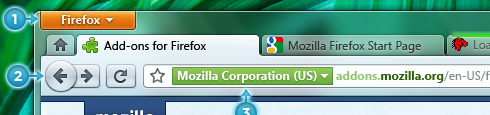
- Location Bar: Created some very early visuals for reevaluating site identity. Also the location bar is now properly recessed instead of floating.
- Retain Separate Search Bar: With the LocationBar containing an increasing amount of functionality it may be best to retain a clear distinction between the two fields.
- Bookmarks Widget: On a default profile or existing profile that hasn’t modified the Bookmarks Toolbar it will be hidden by default and the Bookmarks Widget placed in the Navigation Toolbar. If the Bookmarks Toolbar is shown the Bookmarks Widget will appear there instead."
Firefox 3.6 Beta 5 (Beta revision 5) for Windows is available for download here.
Firefox 3.6 Beta 5 (Beta revision 5) for Mac OS X is available for download here.
Firefox 3.6 Beta 5 (Beta revision 5) for Linux is available for download here.