Firefox 17 is now in the Aurora channel, completing the latest upgrade cycle, Firefox 15 in the stable channel, Firefox 16 in beta and now Firefox 17 Aurora.
The latest and greatest Firefox comes with a number of new features and improvements, but it's not exactly an impressive selection. More features may land while Firefox in is in Aurora.
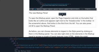
Once again though, web developers have it good, the dev tools are continuing to improve. Firefox 17 brings the ability to edit HTML along with CSS, via the new Markup panel, making it possible to make changes to a page and quickly test or prototype something without going back and forth between the browser and a code editor.
In-line HTML editing
"To open the Markup panel, open the Page Inspector and click on the button that looks like an outline and appears right next to the 'breadcrumbs' in the toolbar," Mozilla's Kevin Dangoor explained.
Devs had the ability to edit some HTML properties in previous versions of Firefox, but the Markup panel in Firefox 17 goes beyond just changing some values.
You can edit any element, remove them entirely or add parameters to existing tags. You still can't add any arbitrary code, but the new panel is much more capable than before.
"You’ll also find that keyboard navigation for getting around and editing the DOM is easy to work with. You can use the tab key to move around within a tag and the arrow keys to move between nodes," Dangoor added.
A lighter color theme for the dev tools, no more overlay in the Page Inspector
Mozilla is also thinking of dropping the current dark theme of the web developer tools, which is actually pretty cool, in favor of a light theme which may be a bit more practical. An option to switch between the two themes would be nice, but it doesn't look like it's going to happen.
Speaking of color themes and visual elements, the Page Inspector is getting a revamp as well. When it was first introduced, the Page Inspector enabled devs to select HTML elements visually from the page.
To make it easier to discover the selected element, the rest of the page was covered with a dark overlay.
It looked nice and impressive, but it also meant that changes were harder to spot, especially those to the CSS.
Aiming to make it easier for devs to see what the page will look like after the changes, the overlay has been dropped. Selected elements are now simply surrounded by a small dashed border.

 14 DAY TRIAL //