14 DAY TRIAL //
 Facebook is rolling out the brand new photo lightbox that has been in testing and was spotted by some users last week. The new photo viewer definitely borrows a page out of Google+, not that that's a bad thing.
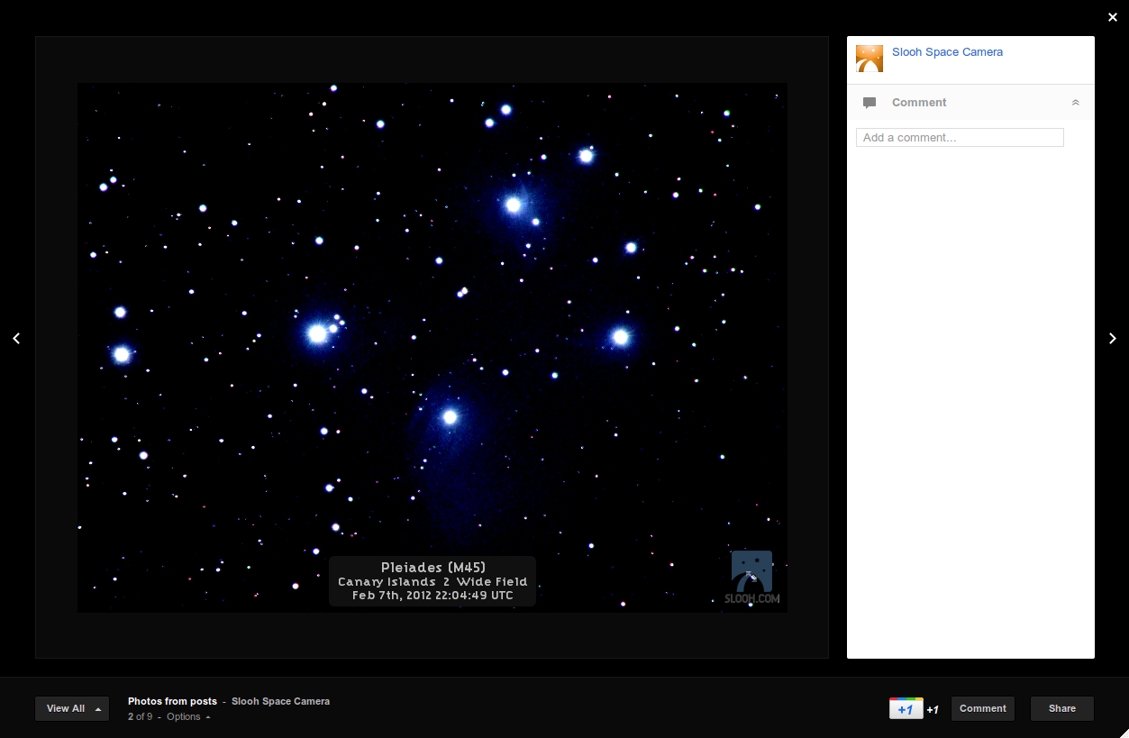
Comments have been moved to the right, the background now fades to black rather than to white and the photos are better emphasized.
That said, some still find it inferior to the Google+ photo viewer, mostly because it still doesn't show photos as large as the Google one. From a purely aesthetic point of view, the Facebook photo viewer looks a bit more polished and better integrated with the rest of the site.
Facebook debuted a new, lightbox photo viewer last summer. It was a big improvement over the previous one and 2011 was a good year for the photos section of the site. But it had been in the works for months.
In fact, the early versions had a faded black background, like the photo viewer Facebook is now rolling out. But by the time it was made available to everyone, last summer, a white background was chosen.
The big change in the new viewer is the comments section, which has now been moved to the right. Previously, it sat below the photos, like they would below a regular post.
This wasn't the best use of space as desktops tend to have much more space horizontally rather than vertically. With the comments to the side, there's more space for the photos, not that Facebook is taking advantage of that.
Facebook did increase the size of the photos in the viewer last year, but they're still not as big as Google+ ones. And, of course, older photos are still smaller, taking up only a small portion of the screen.