14 DAY TRIAL //
 Facebook may not be an innovator when it comes to design and usability, but it's effectively keeping up with everyone else doing the real innovating. That's not to say that Facebook just copies others, but it prefers ideas that are tested and small incremental changes rather than radical redesigns, Timeline notwithstanding.
So perhaps it's not that surprising that Facebook updated its mobile site and the mobile apps to serve large images.
This after the Google+ iPhone app did just that in the latest major redesign. Granted, the Google+ app still looks a lot better than the updated Facebook ones.
The new Facebook mobile website and apps take advantage of every millimeter and stretch news feed posts as much as the screen will allow it, (almost) from side to side.
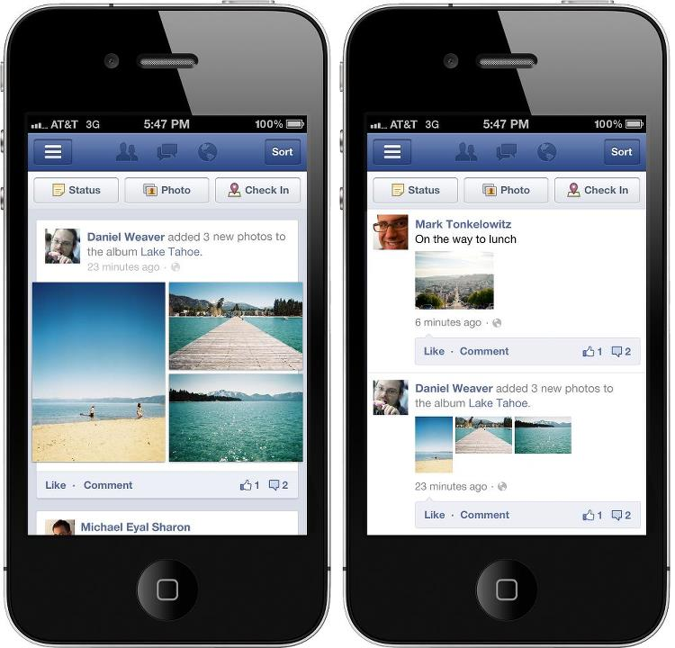
The same goes for photos that are now larger, sometimes three times larger than before, depending on how many thumbnails Facebook decides to fit in a news feed entry.
Of course, Instagram and other mobile apps have the same basic layout and also try to make the most of the space available.
It's such an obvious design choice that it's a wonder it took most app makers this long to figure it out. Especially when you look at the before and after shots of the Facebook app you realize how poorly thought out the previous design was.
It's just the regular news feed squeezed to the smaller screen with little thought given to whether what works for a full desktop browser works for a mobile one or an app. In the old version, each post is surrounded by huge amounts of whitespace, to the right and to the left.
Google+ can waste this much space on the desktop, but it stretches as far as possible on mobile devices. Now, the Facebook apps and site do the same.