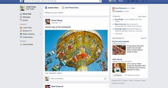
One of Facebook’s designers has revealed that the social network has chosen a more conservative format for its site because of all the small screens that users have around the world.
Last year, Facebook had a rather different idea about how the News Feed was supposed to look – full of large images – but somewhere along the way, it decided to pick a more conservative format.
Some assumed that this was because of dropping numbers when it came to visiting times. Blogger and designer Dustin Curtis, for instance, writes that the social network had noticed during testing that users didn’t feel the need to browse the site for too long, which translated into less ad money.
While the assumption isn’t that absurd, the truth seems to be completely different, however. Julie Zhuo, director of product design at Facebook, debunks Curtis’ theories.
“The goal of making News Feed all about the content—with bigger photos and more expressive stories—is near and dear to my heart. It’s why we started the project in the first place,” she writes.
She admits, however, that the original design they had thought of for the site just wasn’t suitable for everyone.
“It turns out, while I (and maybe you as well) have sharp, stunning super high-resolution 27-inch monitors, many more people in the world do not. Low-res, small screens are more common across the world than hi-res Apple or Dell monitors. And the old design we tested didn’t work very well on a 10-inch Netbook,” Zhuo wrote.
She points out that single stories barely fit on the viewport for some users. Furthermore, the length of the stories was particularly important as well, since many users scroll through the pages by using clicking or by dragging the browser scrollbar, rather than using trackpads or the scroll wheels on the mouse.
“If more scrolling is required because every story is taller, or navigation requires greater mouse movement because it’s further away, then the site becomes harder to use,” she explains, reminding us all that not everyone has access to the same hardware.
While the design that was tested last year would actually have been good for revenue, that wasn’t reason enough for Facebook to implement it.
Instead, the new design that's currently being rolled out to everyone delivers larger photos, videos, and statuses and cleans up a lot of clutter. This is something that people like more than in the previous design, without making Facebook more difficult to use.

 14 DAY TRIAL //