14 DAY TRIAL //
 Google has been transitioning all of its products to the new Google+ like design. It's already gotten some of its sites in line and it is now testing a redesign of the editors in Google Docs, arguably much harder to upgrade properly than simpler sites like the Google Help Pages or even Google Calendar.
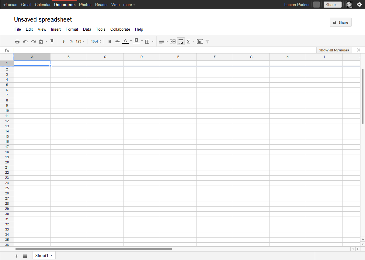
If you're using Google Docs and any of the document, spreadsheets or drawings editors, you get the option to check out the new design.
As expected, the redesigned editors fall in line with the new Google design mantra, which means a lot of gray and few colors.
In fact, the new editors only feature white, gray and black. This may make the toolbar buttons a bit harder to spot, especially with the more stylized icons. The washed out gray also makes it look like some are disabled.
Overall though, it’s probably not going to be a problem and Google will update the design if it finds that there are usability issues.
The toolbar as well as the header look a bit more spaced out, common with all sites converted to the new design, but Google Docs has never been too efficient with header space before.
That said, it's probably not going to be much of a problem and the new toolbar is also less distracting if all you need is to focus on what you're doing.
And the new Google Docs editors certainly look a lot better than the ones they're replacing, which, while functional, wouldn't win any beauty contest.
The Google Docs homepage has already been updated to the new design, also optional for now. It too suffers from some setbacks, but overall, it is practical.
The redesigned homepage is still optional and you can choose to revert to the current layout if you wish. That option doesn't seem to be possible for the editors, once you've made the switch, you're stuck with it.