YouTube is currently testing a new design. It seems to be rather serious about it, since there are more and more sightings in the wild and the design is evolving constantly.
It is starting to look more and more like Cosmic Panda, which can only be a good thing, but on the whole it is much more similar to the current design than the experimental version YouTube debuted last summer.
It also looks like YouTube is getting closer to launching the new redesign. Currently, the experimental YouTube is going for a gray look and replaces some links with buttons, but it's not much of a departure from the current YouTube that everyone is seeing, in terms of layout and features.
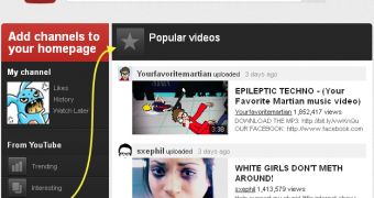
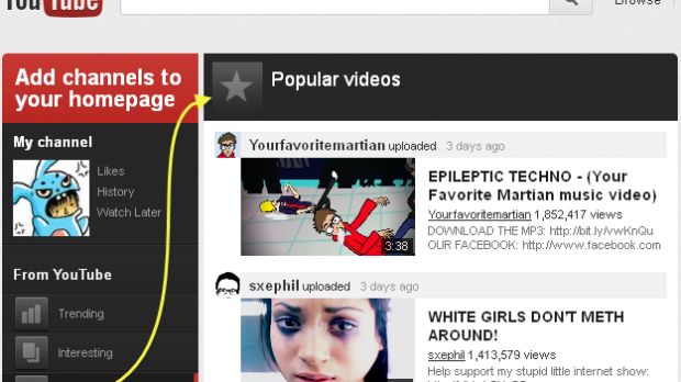
That may change as the design evolves. One thing that's very new and that only a few users are seeing, even among those part of the experiment, is a redesigned YouTube homepage.
The current homepage, for all of YouTube's work put into it, is bland to say the least. It's not very useful either, judging by the amount of changes YouTube has done to it over time.
The new experimental homepage is quite a departure. All of the current elements are there, but the layout is more intuitive and much better looking.
The page is split into two now, there's a sidebar on the left with all of your subscriptions and channel bookmarks as well as things like popular or trending videos.
The homepage seems to be the most visually evolved segment in the new redesign. Going by it alone, the new YouTube look should feel rather stylish and modern, while also retaining its simplicity.
YouTube is still working on it, so it may be a while before the redesign is rolled out to everyone, but it's pretty clear at this point that it's coming, sooner or later.

 14 DAY TRIAL //
