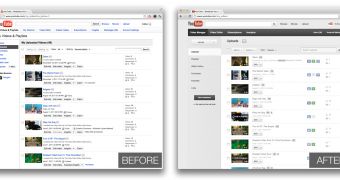
By now, everyone has noticed the new YouTube. But the site is getting a revamp behind the scenes as well, the Video Manager page has gotten a new look as well.
It's still in testing, meaning that it's not yet the default, but you can start testing it right away. The new page comes in line with the new YouTube look, but there are a few layout changes and usability improvements as well.
"You put a lot of work into your videos, so we’re putting a lot of work into making sure they look their best on YouTube," the site wrote.
"Today we’re rolling out an updated Video Manager with some new features that’ll help you handle all your videos. To try out the new design, go to the Video Manager and click 'try it now'," it announced.
The new page makes it easy to get more info on your videos at a glance. The top and left navigational bars have been simplified, YouTube says. Some of the links have been removed and the ones that are still there have been left are better spaced out and grouped.
Of course, improving on the old page, which was kind of a mess, wasn't that hard in this respect.
The video list has gotten some improvements as well, there are now labels next to each video to indicate whether it is a private video, whether monetization is enabled or whether the video is scheduled to be published at a later time.
There are also badges to indicate whether the video is in HD or whether it is close captioned. Of course, the entire page now follows the new YouTube design.
The editing tools page has been updated as well, the changes aren't great, mostly a new layout and adoption of the new design elements.

 14 DAY TRIAL //