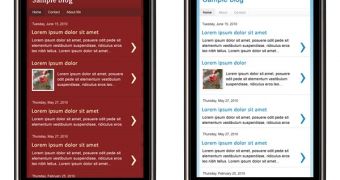
The mobile web is expanding at a faster rate than ever. While smartphones today are fully capable of handling the web, from a technical perspective - thanks to the powerful browsers in iPhones, Android devices and so on, the web was not built for small screens and touch input. But it is slowly adjusting, Blogger, for example, now provides users the option to enable a mobile version of their blogs.
"We know many of you like to view blog posts on your smartphones. However, it can be difficult at times because of the small screen size. This is why we are excited to announce our first launch of mobile templates!," Jiho Han, software engineer at Blogger, announced.
"Initially available as opt-in functionality on Blogger in Draft, mobile templates will re-format your blogs for smartphones to enhance your readers’ viewing experience," he added.
"In order to activate mobile templates, simply go to Dashboard > Settings > Email & Mobile tab, enable the mobile template option and then save settings," he explained.
The new feature is only available if you're using draft.blogger.com rather than the regular dashboard. You don't get that many options for now, you can either have it enabled or not and you can check out a preview of what your blog will look like on mobile devices.
If you do enable it, users visiting on a mobile device using a WebKit based browser will be redirected to the mobile version.
At this point, there's not that much you can do to customize how the mobile blog looks. If you are using some of the templates in the new Template Designer for your blog, then the option will be used for the mobile site as well. Otherwise the default Simple template color scheme will be used.
Blogger notes that the mobile version of the site supports advertising and also enables users to comment and watch video content in the posts. The feature is still in Draft for now, but it will be rolled out to everyone once Google is confident that it's stable enough.

 14 DAY TRIAL //