Softpedia
 

NEWS CATEGORIES:


NEWS ARCHIVE >>
SOFTPEDIA REVIEWS >>
MEET THE EDITORS >>
TRENDING TODAY
Home > News > Apple > Personal Thoughts

June 9th, 2012, 00:41 GMT · By

Apple, Please Put Some Decent Scroll Bars in OS X Mountain Lion

SHARE:

Adjust text size:

Scrollbar issue in OS X Lion
Enlarge picture
I write news for a living, and I’m also an avid Mac user and a fan of the Apple ecosystem at large. Of course, that doesn’t mean I have to like everything about Apple, its brand, or its products. And a good example are the incredibly annoying scroll bars in Lion.

Hoping to single-handedly convince Apple Inc. to implement a change in OS X is utterly naive. But I’m giving it a shot.

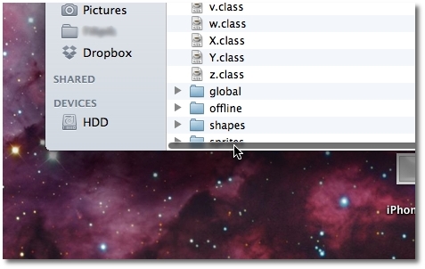
The image below shows something that many Lion users have to go through every day.

Having to resize every single folder that contains one too many files simply to access that last one at the bottom is excruciatingly annoying!

And it’s only because Apple wanted to blend iOS with OS X. Which is fine, in essence. We like the whole shebang. We just don’t want all of iOS in OS X. We can do without this minute feature.

Review image

Admittedly, there’s an option to put the constantly-visible scroll bars back in, but it doesn’t get much better (as the image below shows).

The default should really be the opposite. Ultimately, you still have to work around this issue to make your files visible and, most importantly, accessible.

Review image

And it’s not just the Finder that’s affected by this, but PDF viewing too. I have to actually make a scroll to get the bars to pop out in order to use them. That’s really cumbersome.

Apple, remember when Steve Jobs said not to ask yourselves what he would have done? You could make an exception here. If Steve was still around, he'd have an anxious intern work over the weekend to have those scroll bars ready for the WWDC opening keynote on Monday.

(That’s an exaggeration to make my point. Plus, if Apple wants a public release next week, the OS X 10.8 Golden Master build is probably already done).

And if one voice doesn’t cut it, maybe more voices will. Feel like writing a comment?


2,664 hits · 4 comments
Link to this article · Print article · Send to friend

MUST-READ RELATED ARTICLES:


Prediction: Everyone Will Ditch Lion when OS X 10.8 Comes Out

Resetting Passwords in OS X Is Too Easy

Futulele for iPad Is a Strange Musical Tool

Apple to Snorters: Too Bad, Buy a Different Phone if Siri Isn’t Pristine

Desktop Macs to Become Obsolete with Matrox DS1 Thunderbolt Docking Station

READER COMMENTS:


Comment #1 by: Iamthepiguy on 09 Jun 2012, 02:07 UTC reply to this comment

Well what do you want? Would you prefer if the window just resized to show all the files? I would find that incredibly annoying.


Comment #2 by: kBear on 09 Jun 2012, 08:18 UTC reply to this comment

I completely agree. Adding iOS features designed for a 3.5" screen to Mac OS X, which is designed for 24" - 30" screens is (insert extreme yet witty adjective here)


Comment #3 by: Anshuman on 09 Jun 2012, 11:18 UTC reply to this comment

if you could write something about the visual drawbacks of windows 8 too.
i know so there are tons of articles about metro but i want you to make an exception and write about the ribbon ui in explorer which i hate passionately.

A Happy Reader of Yours. :)


Comment #4 by: Daniel on 09 Jun 2012, 23:24 UTC reply to this comment

I guess the idea behind this is that with multi-touch trackpads and the magic mouse, you shouldn't need to touch the scroll bars at all.

Copyright © 2001-2013 Softpedia. Contact/Tip us at

WindowsGamesDriversMacLinuxScriptsMobileHandheldNews

SUBMIT PROGRAM   |   ADVERTISE   |   GET HELP   |   SEND US FEEDBACK   |   RSS FEEDS   |   UPDATE YOUR SOFTWARE   |   ROMANIAN FORUM