
 14 DAY TRIAL //
 Apple has issued a redesigned Support site today, and while the changes may not seem major at first glance, many customers will be delighted with some of the new functions set in place by the backend developers in Cupertino, California.
After leaving the Support / Downloads section unattended for over a month, this week Apple released updated printer drivers for OS X 10.7 (Lion) and OS X 10.6 (Snow Leopard).
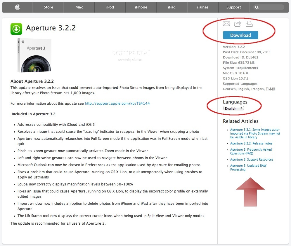
Other important updates distributed via Support / Downloads in the past couple of months included Logic Express 9.1.6, iTunes 10.5.2, and Aperture 3.2.2.
I’ll be using the page featuring the Aperture release to highlight the changes made to the layout of Apple’s Downloads section.
Downloads area
As the screenshot below shows, visitors are greeted by a differently arranged set of release notes, complete with a new Download button that’s colored blue (or turquoise, or something).
Knowledge base articles / tech-notes
For Support articles similar alterations have been made.
The release date and document ID can now be seen on the right-hand side and, just below those, customers can now track the view count, which helps asses the importance of the document in question.
Interestingly, one of Apple’s latest tech-notes (exemplified below) shows a view count of 0. Either everyone has dropped FCP X and switched to Avid, or Apple’s technicians are still ironing out some bugs.
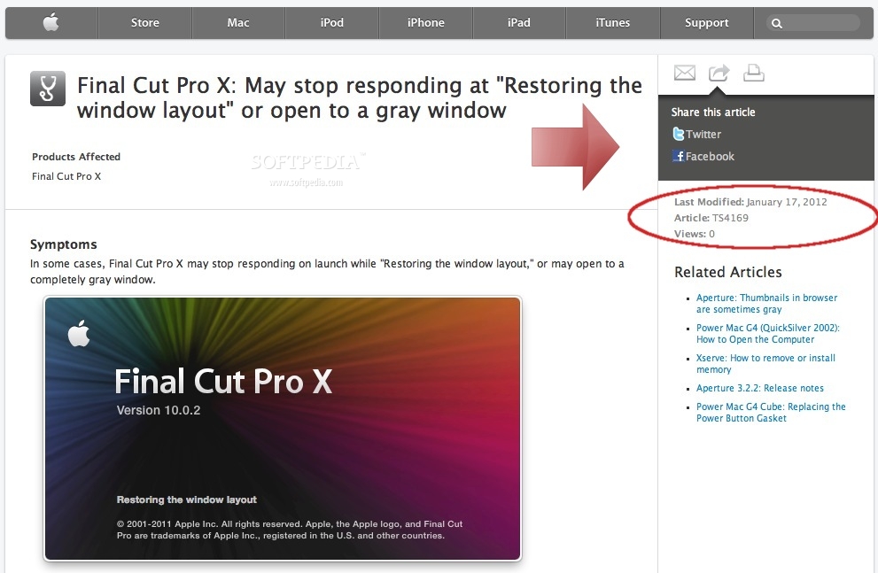
The entire layout is now cleaner. A separator can be found between the Affected Products and the Symptoms, and even the imagery used for examples appears to be of better quality.
All in all, Apple’s Support site has received a much deserved makeover that should delight fans everywhere.
I found it particularly awesome to be able to read the iOS 5.0.1 release notes in Romanian, complete with the appropriate diacritical marks!
How are you liking these changes? Sound off in the comments.