14 DAY TRIAL //
 Google is testing a new version of its homepage, continuing its quest of getting rid of the top toolbar and replacing it with something more pleasant to the eye, but something that does the job right as well.
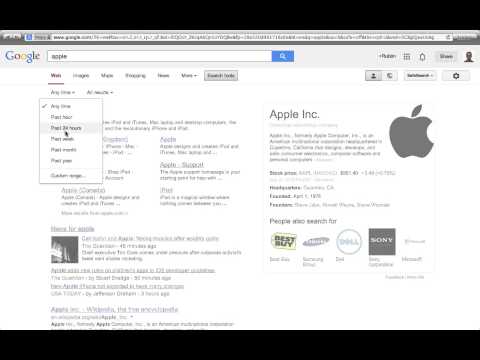
The company has experimented with several options, a drop-down menu to access its various products, more recently with an "apps" button, similar to the one in Chrome, which provides fast access to the most common Google products straight from the homepage or the search results page.
In the latest experiment, it's tweaking that app panel version, by also providing a few direct links alongside the apps menu.
In the video from the Tecno Net blog, you'll notice links to Gmail, Image Search and Google+ clearly visible next to the apps menu button and the Google+ share and profile buttons. Notably absent, of course, is the black navbar.
The Google+ link seems a bit redundant, since the social network can be accessed from the profile-drop down menu as well. It gets worse in the app menu, as Google+ is again listed. It adds up to three links to the same site all next to each other. Gmail is listed again as well.
The Google+ share box is largely unchanged, though the Share button has been tweaked a bit. On the search results page, the search button is moved closer to the search bar, but that seems to be the extent of the tweaks.
The big question, of course, is whether Google makes this version of the homepage, or something very similar to it, the default for everyone or whether it will continue to look for a design that looks better but, more importantly, works better for most people as well.
What is clear is that Google has its mind set on getting rid of the top navbar and that it's going to experiment with designs until it finds one that works.